Modelling S-Curves in Disruptive Innovations

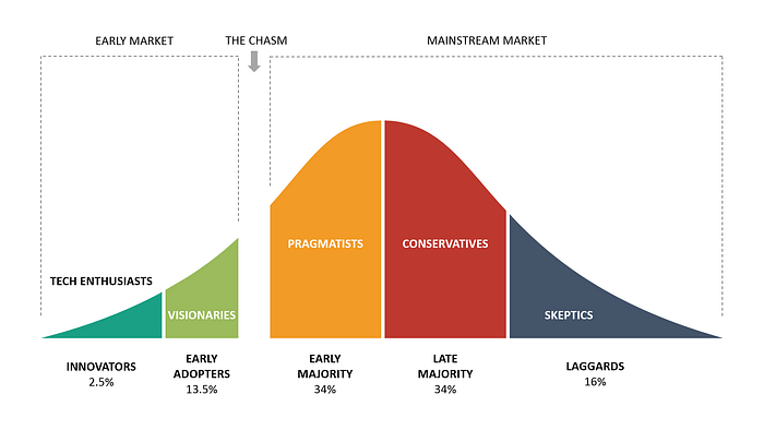
The technology adoption life cycle (TALC) is a graph that every disruptive innovation investor should be familiar with. TALC states that the time at which different people adopt a new technology follows a bell curve distribution. In the beginning, a few enthusiasts and visionaries adopt the technology. The vast majority adopt it sometime in the middle, and the few skeptics reluctantly adopt it near the end of the life cycle.
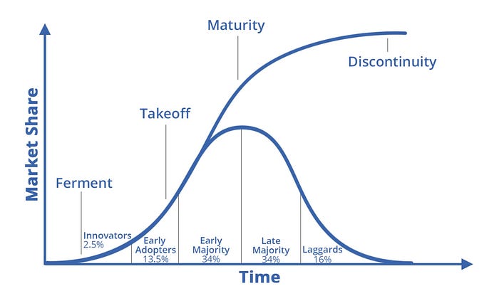
However, the number of new adopters is not as relevant as the total number of users when forecasting product sales. Users can be split into first-time customers who make initial purchases and existing customers making product replacement purchases. As we reach the early majority stage of the TALC, first-time customers begin to flood the market, rapidly increasing overall sales. As we enter the late majority, there is an inflection point in product sales since the rate of new customers begins to slow, which also slows the rate at which sales are increasing. Eventually, all sales come from product replacements, but since there are so many customers who have adopted the technology now, sales are still at or near an all-time high.
All this can be graphed by plotting total sales with respect to time (see Figure 2 below).

Since TALC creates an S-Curve, we can use the following general S-Curve equation to model growth. If you are interested in how I derived this equation, I explain it in more detail here.

R(t) = Revenue at time t
t = time elapsed
TAM = Total addressable market
k = growth constant
b = constant of integration
Note that TAM, k, and b are constants, not variables, meaning they don’t change with time. TAM can be easily estimated, but k and b are arbitrary constants we will need to solve for. The method to do so is fairly simple and will be explained in the following section.
Application to Electric Vehicles
We will now apply the aforementioned equation to model the S-Curve of EV adoption. In order to do so, we will need to make two assumptions.
- What is the total addressable market (TAM)? This will determine when the S-Curve will level off.
Annual global car sales are around 80 million. However, due to its fewer parts, an EV is more reliable than a gas car, which would decrease the number of sales from product repurchases. Nevertheless, after factoring in the world’s growing population, I think it’s fair to keep the TAM at 80 million. One more assumption that is implied is that EVs will make up 100% of car sales sooner or later. Considering the fact that they will soon be cheaper than gas cars, have better performance, and are more sustainable, I will proceed in making this assumption.
2. At what time does the S-Curve begin?
This is a trickier one. Choosing a time too early, like 2005, would overestimate the speed of growth. On the other hand, selecting a time too late, like 2020, would underestimate it. We will play around with this variable later, but let’s choose 2015 as the beginning of the S-Curve for now.
Let us now put on our algebra hats and begin coming up with a specific equation by finding values for the constants TAM, b, and k. TAM is equal to 80,000,000 due to the first assumption. Furthermore, since 540,000 plug-in cars were sold in 2015, and we are assuming 2015 to be the start of the S-Curve, we know that R(0) = 540,000.

Solving for b, we get b = 147.15
One more piece of information we have is that 3.24 million plug-ins were sold in 2020. Since 2020 is 5 years after 2015, we know R(5) = 3,240,000. Using this and the value of b we just found, we can solve for the final missing constant, k.

Solving for k, we get k = 0.365.
Now, let’s rewrite the final equation using the values of b and k we found and see what it looks like when graphed!

Figure 3 is the graph of the above equation. Notice how the y-intercept of the graph is at 540,000, which is the number of plug-ins sold in 2015. The point (5, 3 240 000) is also on the graph representing the 3.24 million vehicles sold in Year 5 (2020). Furthermore, we can forecast the global EV sales for this year to be around 4.58 million. For all intents and purposes, the S-Curve levels off by around year 25. Since we started in 2015, year 25 would be 2040.
As promised, we will now adjust the year in which the S-Curve starts. The following table shows forecasts of future sales and the year the S-Curve levels off. The calculations were done in the same way as previously indicated. Unfortunately, 2010 is the earliest year that I could obtain accurate data for the number of EVs sold that year, so I did not model any S-Curves with a start year before 2010.

The purpose of modelling the function with different starting years is not to generate different sales projections for 2021. Instead, it is meant to highlight how changes in the starting year used can drastically affect outcomes.
Remember, the starting year represents the beginning of the S-Curve. For EVs, the S-Curve didn’t begin in 2018, nor did it begin in 2015 or 2012 for that matter. The exact year is debatable, but 2010 is as close as we’re going to get to the beginning of the S-Curve for EVs. This means, if we want an accurate projection of future sales, we should use 2010 as the starting point.
Using the points P(0) = 24,500 and P(10) = 3,240,000 (where t is the number of years after 2010, so t=10 means 2020) to solve for the constants b and k as previously shown, we obtain the following equation.

To forecast the sales for 2021, let t = 11 and evaluate the expression. You should obtain a number of around 5,192,000. Note that since the statistics used measured plug-in vehicles, which includes hybrids. The number of pure EVs sold will likely be lower than this. You can also graph this yourself using graphing technology to see what the S-Curve looks like and forecast EV sales for each year. Just remember that t is equal to the number of years after 2010.
Caveats
Several factors should be considered when using this S-Curve model to forecast sales and/or technology adoption.
- It does not take into account any other factor apart from the technology adoption life cycle.
Not accounting for potential supply constraints, demand constraints, Wright’s Law, or how robotaxis might affect sales may be reasons to believe this model is inaccurate. However, in order to account for the aforementioned factors, you must make more assumptions. When you make assumptions, the risk of your model being wrong increases. The only assumptions this model made are the total addressable market and when the S-Curve begins. Both of these assumptions can be made with a fair degree of certainty. This is not to say that this model is more accurate than all others, only that it should not be discounted because of its simplicity.
2. It is not very useful for modelling revenues of individual companies
This is because more factors affect the sales of a particular company than factors that affect an overall industry. Many disruptive innovators will become supply-constrained at some point, meaning the company cannot produce enough products to satisfy all demand. This would cause sales to deviate from the standard S-Curve. Moreover, unforeseen competitors can take away market share from existing companies (just imagine using an S-Curve to model Nokia’s growth trajectory in 2007).
3. On the subject of electric vehicles, this model can be used to forecast the output of gigafactories over time
Since projects such as ramping the production of newly built factories often model an S-Curve, the model used in this article can forecast how many cars are produced month over month. You don’t even have to assume when the S-Curve begins because it begins as soon as the factory begins production. As for the total addressable market, that becomes the production capability once the factory reaches full capacity.
I want to conclude with a comparison between this model and the projections of ARK Invest with respect to the EV market. ARK believes that technological advancements will decrease costs by Wright’s Law and bring down the $/charging rate metric. These positive deflationary forces drive down prices and drive up demand. In January 2020, ARK Invest forecasted 37 million in global EV sales in 2024. My model is slightly more conservative, with sales reaching 37 million in 2025. On the other hand, so many traditional analysts don’t even see sales reaching 37 million by the end of the decade. I don’t know how accurate my model will be, but I do know that theirs is completely bogus.
From electric cars to genome editing, from fintech to 3D printing, and from the blockchain to space exploration, innovation is at the doorstep. Although exponential growth is indistinguishable from linear growth early on, know that time and time again, the adoption rate of new technologies follows an S-Curve. Also, know that despite having its flaws, the simple equation provided here will allow you to model the growth of emerging industries more accurately than many traditional analysts.